We know that there is a lot of information given during and after a hearing test and it can be overwhelming trying to remember all the details. This article is intended to give you the basics so you can better understand your own hearing test results.
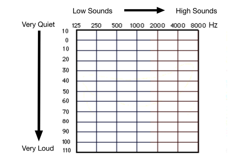
When you sat in the sound booth and pressed a button whenever you heard a beep it gave us results that we would have plotted on a graph. The vertical axis of the graph indicates the volume with very quiet being at the top and very loud being at the bottom. The horizontal axis indicated the frequency or pitch, with the low sounds on the left side and getting higher moving toward the right side. Below is an outline of this chart without any points plotted on it yet.
Now since both ears are plotted on the same chart we need a way to separate the two ears, so we use different symbols to indicate left and right. The plotted points that are associated with the left ear are X and the plotted points representing the right ear is O. There may also be some triangles (right), squares (left), brackets, or less than/more than symbols but don’t worry about those for now, just focus on the X and O. You may also see colors associated with these symbols. If this is the case, red always represents the right ear and blue represents the left ear, at least when dealing with audiology.
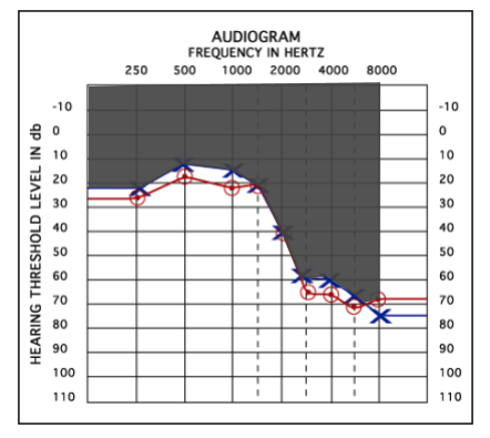
Now, this is the part where things can get a little more complicated. The X’s and O’s indicate the quietest sound that you are able to identify and respond to (usually by pressing a button or raising your hand). So what this means is that you are able to hear all the sounds that occur BELOW the line of X’s or O’s but not the sounds that occur above the X’s or O’s. In the example below, you will notice that graph has a curved sloped shape with the right-hand side being lower. This means that the patient could not identify the beeps until they were turned up quite loud. In this example, the area that is grey is the area that the patient CANNOT hear. So this patient can hear low-pitched sounds at a much quieter level than they can hear high-pitched sounds.
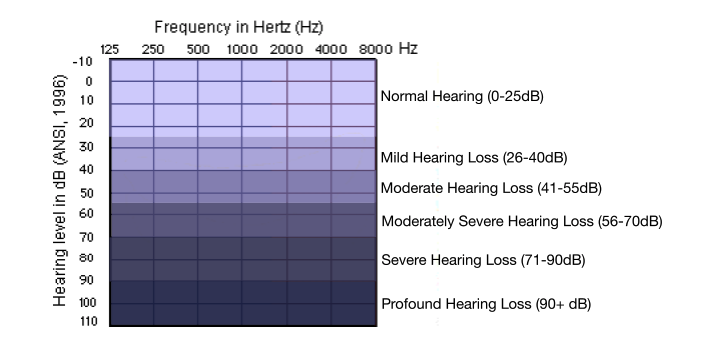
Depending on where these X’s and O’s are located indicates the severity of the hearing loss and in turn the more amplification the patient will need to hear those sounds again. In order for there to be consistency between audiologists and other hearing professions, there are set guidelines for describing the severity of the patient’s hearing loss. Below you can see an example indicating the severity of the hearing loss.
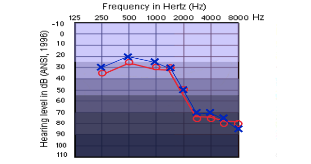
If we now take the X’s and O’s from the previous audiogram we can now see that this patient has a mild hearing loss in the low frequencies dropping to a severe hearing loss in the high frequencies.
At this point, you may be thinking, “Well that’s great but how does this graph apply to my hearing in the real world?” Not to worry, we’ve got one more graph to explain just that!
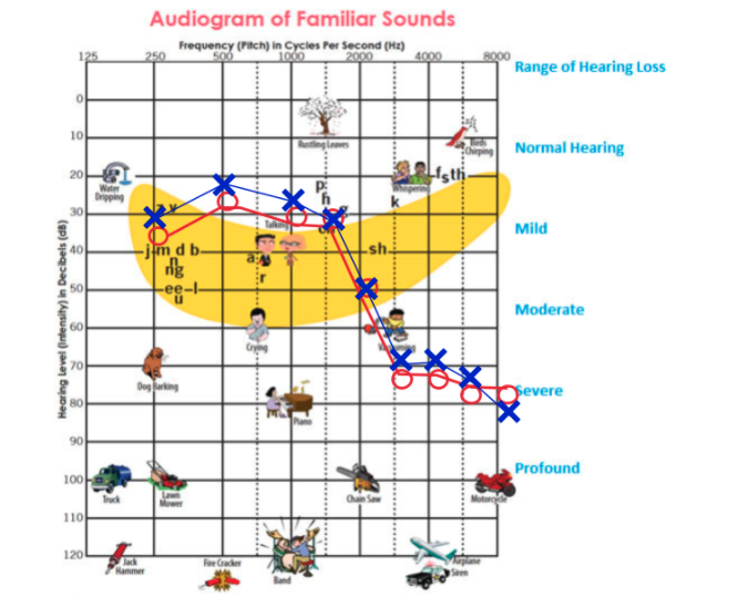
This graph is oriented the same way as the previous graphs with the pitches moving from low on the left, to high pitches on the right and the volume vertically with quiet sounds on the top and loud sounds at the bottom. The difference with this graph is that it has some common sounds on it so you have some reference points on it. The big yellow area is often referred to as the speech banana and this is the level at which speech sounds occur. Remember that everything below the X’s and O’s can be heard but anything above this line cannot be heard.
So this patient will have no trouble hearing airplanes, motorcycles, or dogs barking but they cannot hear people whispering, leaves rustling or birds chirping. This patient would also have trouble understanding someone saying, “That fat cat sat,” if they do not have any visual cue (such as see your mouth).
Hopefully, this has been helpful in understanding the results of your audiogram. If you have specific questions regarding your hearing loss or any devices such as hearing aids that may be helpful to you, please let us know and we would be happy to talk to you about it further!

